Eddy’s HR Mavericks Encyclopedia
The world's largest free encyclopedia of HR, with 700+ HR articles and podcasts.
Created by Eddy and our HR Mavericks community.
Careers Page
Considering creating or revamping your organization’s online careers page? Read this article to help you get rolling! Below, you’ll find the main reasons to invest in an improved online presence, elements of an effective careers page, examples of great careers pages you might model your own after, and software tools to consider using to build it.
What Is a Careers Page?
A careers page is a critical piece of your employer brand! In short, it is a web page that provides exciting information about the experience of working for your organization, invites prospective job candidates to apply for your open positions and hosts the method by which they can submit an application.
Why Your Company Needs One
In today’s connected world, expectations are high for potential employers. Your careers page should be the go-to source for questions a candidate might reasonably ask about the company as they determine whether to apply for a job.
- Sell your differentiation. With so many employers making information easily accessible online today, you need a way to advertise what makes you special if you want to stand out and bring in the right talent.
- Consumer expectations. Your prospective candidates use apps and websites every day that have beautiful user interfaces and smoothly point them to the information they need. Their expectations for high-quality technological experiences and ease of finding important information extends to their choice in employers! Given the low tolerance for clunky, inefficient processes, you want to make the experience of looking for a job at your company as close as possible to the experience of looking for something to purchase on your favorite online store.
- Simplifying recruiting. How much more efficiently do you think your recruiting or HR team will be able to manage a candidate pool when all applications come through a centralized system rather than through a variety of recruiters’ email accounts?
- Standardizing employer brand. When you provide the information to answer common questions about employment at your company online, you ensure that the same message is communicated to all prospective candidates upfront. This can help improve self-selection, among other benefits. Candidates who are clearly not a fit for the values, mission or roles your company focuses on will often be able to determine that for themselves and self-select out of the process, rather than using their own valuable time and energy and that of your recruiters and hiring managers to go through part of the hiring process before recognizing the poor fit.
What an Effective Careers Page Looks Like
A list of the open roles at your organization is a critical part of a great careers page, but it is far from the only critical piece. With the easy accessibility of all kinds of information online in today’s connected world, your careers page needs to make it simple for prospective candidates to get the information they need to make the decision to submit an application.
1. Your Organization’s Story
Today’s job seekers are placing greater emphasis on finding meaning in their work. Few things can better help to communicate your company’s purpose than a brief overview of where the organization came from, where it is going and how you hope prospective candidates will help it get there. Telling that narrative upfront (often with pictures and other design elements to illustrate it) can be a powerful introduction. An overview of your company mission, vision and values, tailored specifically to job seekers rather than customers or investors (as you may have elsewhere on your company website), can easily follow that story and help get them excited about the prospect of being a part of your purpose.
2. Easy Access to Current Job Listings
Some career pages look pretty, but the focus on aesthetics has led to the current job openings being hidden several clicks or scrolls down. While the fun information about your company culture, work environment and benefits are important, many job seekers want to see whether there is actually an open position that they would be interested in before taking the time to go through those additional details. This doesn’t mean that the first thing they see when they navigate to your careers page should be the list of open positions. Just be sure that when they get to the careers page there is easy and clear navigation directly to those listings for the job seekers who want to get straight to it. The job descriptions themselves are another crucial aspect of the careers page. See our Candidate Experience and Job Description encyclopedia entries for ideas on making this element jump off the page!
3. Culture and the Work Environment
Prospective candidates want to know whether your people are their kind of people! Does your organization value work/life balance or a similar concept? Is yours more focused on working incredibly hard to accomplish something great? Or is it somewhere in between? Providing an authentic look at what makes the majority of people in your organization tick and how they get things done can help ensure that the right people apply to work for you. This can also go a step deeper than just company culture — consider including information, stories and employee highlights specific to each primary team or department. A software developer may want a realistic job preview and idea of how the development team operates, which is likely to be very different from the experience of working in sales and marketing. That department dynamic can be just as important in helping a prospective candidate make the decision to apply as the overall company culture. Another aspect of the culture and work environment that can be important for many of today’s job seekers is an overview of any volunteerism or other causes the organization is involved in. If your organization emphasizes sustainability, talk about your investments in that space. If you do significant volunteering or community service days as a company each year, that’s probably something many prospective candidates will be interested in hearing. Show job seekers any ways that your culture and values extend outside of your own organization.
4. Benefits
While job seekers definitely want to know whether they will feel like they fit in the organizational culture and can work in a way that is ideal for them, selling the other benefits of employment at your organization upfront is another critical purpose of a careers page. Particularly during times when the labor market favors job seekers and the best ones often have multiple opportunities available to them, your benefits can make or break their level of interest in working for you as opposed to another competitor for talent. “Benefits” can be a relatively broad term, a catch-all for any perk of working at your organization that hasn’t already been addressed elsewhere. It should definitely include a list of traditional benefits (bonuses, insurance, retirement plans, paid time off and holidays, etc.) and any other true add-ons that might make your organization stand out (tuition reimbursement, employee assistance programs, onsite cafeteria or free food, etc.). In addition, categories like employee or leadership development opportunities and career growth continue to become more important to the best job seekers. An overview of resources available to assist in career development can fall under a benefits section or be geared more toward culture and the work environment, depending on how you want to frame it, along with employee stories about the career-enhancing opportunities they have received while working for you.
Other Page Design Tips
Interacting with your careers page should be a pleasant, frictionless experience for job seekers. Engaging your marketing team for help in using principles of user-centered design and turning your careers page into an effective sales pitch is a wise overall practice. Additional specific design attributes can include the following.
- Use varied media throughout the page. Include pictures of employees, workspaces and company parties and events. Provide videos of current employees describing their experiences and roles, or leaders of the company explaining the story of how it all came to be, their vision for the future and how current employees fit into the story. Embed employee quotes and headshots throughout to add color to the information you’re providing.
- Simplify your application process. Do your best not to ruin a great careers page experience with a complicated, repetitive job application! Depending on how you collect applications, this may require you to evaluate changing your applicant tracking system if your current tool doesn’t align with the style and look of the rest of your careers page.
- Consider whether using a single page is feasible. As we know from the best online shopping sites, fewer clicks is typically better. If the volume of information you plan to provide on the careers page is small enough, consider including all of it on a single page (likely with the company story and values at the top, followed by current job openings and the employment experience and benefits to wrap it up). If a single page is not a reasonable structure, ensure that job seekers can easily navigate between the various pages from the top of the main careers page.
4 Examples of Great Careers Pages
Below we highlight four careers pages from various types and sizes of companies, each of which have different strengths and elements unique to them. Check them out for a variety of ideas you could use for your site!
1. Tesani
Perhaps a little home field advantage here, but we definitely have a soft spot for the careers page of our sister company! They’ve kept it simple — a couple of powerful taglines and photos at the top, followed by current job postings and then sections on culture and benefits. Part of the appeal of this page is its simplicity. There is enough information to get a job seeker excited to learn more, but not so much that it is overwhelming. The job application process itself is incredibly simple and specifically meant not to overwhelm applicants. https://www.tesani.com/careers
2. EQRx
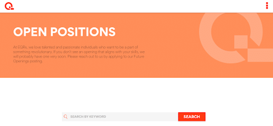
This is a careers page with a couple of unique twists. EQRx highlights their current openings front and center, and includes a note that anyone can apply at any time to their “Future Openings” posting if they don’t see a role that aligns with their skills. It then lists a variety of open jobs, followed by a gamifying element, a “Find Your Professional Superpower” tool that allows job seekers to put in their answer to three multiple-choice questions and immediately get relevant jobs to pop up based on their responses. The questions and answers seem designed both to help prospective candidates find interesting roles and to help them self-select out if they don’t identify with any of the possible multiple choice answers. This is an intriguing element that could spark ideas to make your careers page more engaging. The page finishes with links to their social accounts and information on the leadership team. https://www.eqrx.com/jobs/
3. charity: water
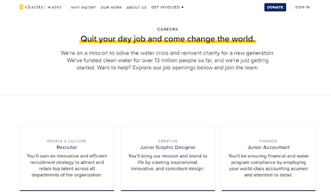
Here is an example of an excellent careers page from a nonprofit organization. They start with a powerful explanation of their mission and call to action, then immediately below they show their open positions in an easy-to-read tile format with a helpful job summary for each role. The rest of the page doubles down on their mission, showing a variety of videos and pictures from the work they have done around the world. They tie off with a description of their benefits, highlighting the fact that they are a remote workforce. The constant connection back to the mission and values of the organization is one of the core things you can learn from a nonprofit such as this. Not every company has such an intrinsically compelling purpose, but identify what gives the work of your organization meaning and drive it home in your careers page. Don’t be afraid to come up with innovative ways to communicate the information on this page. The tiled setup for charity: water’s job openings is unique but highly effective. https://www.charitywater.org/about/jobs
4. General Mills
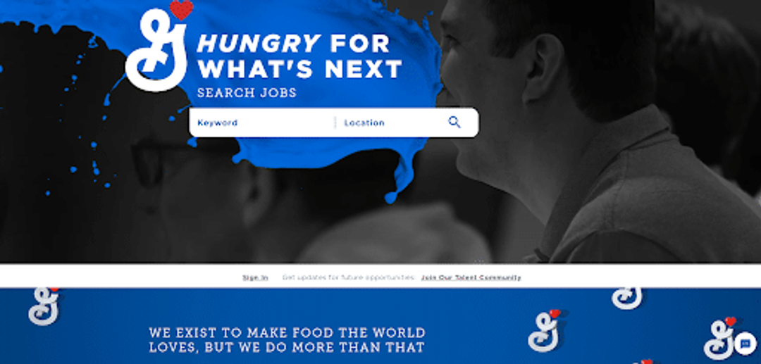
Lastly, for a far more complex careers page, check out General Mills’ site. This large company includes the job search right at the top of the page, followed by a brief description of the kind of people they are looking for to help move their mission forward. They then include links to additional pages going into depth on various cultural aspects, including diversity and inclusion, employee development and life at General Mills, before tying it together by highlighting various career areas, awards and locations. Each of the main subpages are also linked clearly at the top of the main careers page. Again, there is far more complexity in this series of career pages, and we would recommend keeping it simple for most small-to-mid-sized businesses. That said, there are fantastic design elements throughout that you could consider implementing in smaller ways on your own site. The information they provide is very thorough and may give you ideas for additional details you may want to include on your careers page. https://careers.generalmills.com/careers/
Tools to Help You Create and Manage Your Careers Page
Each of the tools highlighted below are applicant tracking systems (ATS) — platforms you can use to host a job board and manage the applicants you receive for each job opening. There is much more detail you can review in our Applicant Tracking System encyclopedia entry, but these examples will give you a great place to start.
Eddy
Eddy was originally founded around our innovative ATS, which has an intuitive pipeline functionality, excellent automation and collaboration tools and a simple interface for applicants.
BambooHR
This HR software tool is often ranked highly for small-to-mid-sized businesses, including their ATS. It includes a mobile hiring app and a smooth flow into an onboarding process, among other functionality.
SmartRecruiters
Built better for larger companies, SmartRecruiters uses artificial intelligence and more comprehensive recruitment marketing than some of the solutions meant for small-to-mid-sized companies.
Greenhouse
One of the faster-growing solutions on the market, Greenhouse is highly focused on automation and provides many integrations to help you scale your recruiting as your business scales.
Topics

Tyler Orr
Tyler is an HR professional-turned-career advisor. After earning a master's in HR and an MBA, he completed several development rotations while working for a Fortune 100 financial services and insurance company. After gaining experience in HR project management, data and analytics, and as an HR business partner, he decided the right next move was a transition into higher ed and career services. He now provides career support for students in a top-ranked supply chain management program at a large Tier 1 university, but maintains a love for the field of HR and an interest in seeing HR professionals succeed and push the envelope!
Frequently asked questions
Other Related Terms
Eddy’s HR Mavericks Encyclopedia
Careers Page
Considering creating or revamping your organization’s online careers page? Read this article to help you get rolling! Below, you’ll find the main reasons to invest in an improved online presence, elements of an effective careers page, examples of great careers pages you might model your own after, and software tools to consider using to build it.
What Is a Careers Page?
A careers page is a critical piece of your employer brand! In short, it is a web page that provides exciting information about the experience of working for your organization, invites prospective job candidates to apply for your open positions and hosts the method by which they can submit an application.
Why Your Company Needs One
In today’s connected world, expectations are high for potential employers. Your careers page should be the go-to source for questions a candidate might reasonably ask about the company as they determine whether to apply for a job.
- Sell your differentiation. With so many employers making information easily accessible online today, you need a way to advertise what makes you special if you want to stand out and bring in the right talent.
- Consumer expectations. Your prospective candidates use apps and websites every day that have beautiful user interfaces and smoothly point them to the information they need. Their expectations for high-quality technological experiences and ease of finding important information extends to their choice in employers! Given the low tolerance for clunky, inefficient processes, you want to make the experience of looking for a job at your company as close as possible to the experience of looking for something to purchase on your favorite online store.
- Simplifying recruiting. How much more efficiently do you think your recruiting or HR team will be able to manage a candidate pool when all applications come through a centralized system rather than through a variety of recruiters’ email accounts?
- Standardizing employer brand. When you provide the information to answer common questions about employment at your company online, you ensure that the same message is communicated to all prospective candidates upfront. This can help improve self-selection, among other benefits. Candidates who are clearly not a fit for the values, mission or roles your company focuses on will often be able to determine that for themselves and self-select out of the process, rather than using their own valuable time and energy and that of your recruiters and hiring managers to go through part of the hiring process before recognizing the poor fit.
What an Effective Careers Page Looks Like
A list of the open roles at your organization is a critical part of a great careers page, but it is far from the only critical piece. With the easy accessibility of all kinds of information online in today’s connected world, your careers page needs to make it simple for prospective candidates to get the information they need to make the decision to submit an application.
1. Your Organization’s Story
Today’s job seekers are placing greater emphasis on finding meaning in their work. Few things can better help to communicate your company’s purpose than a brief overview of where the organization came from, where it is going and how you hope prospective candidates will help it get there. Telling that narrative upfront (often with pictures and other design elements to illustrate it) can be a powerful introduction. An overview of your company mission, vision and values, tailored specifically to job seekers rather than customers or investors (as you may have elsewhere on your company website), can easily follow that story and help get them excited about the prospect of being a part of your purpose.
2. Easy Access to Current Job Listings
Some career pages look pretty, but the focus on aesthetics has led to the current job openings being hidden several clicks or scrolls down. While the fun information about your company culture, work environment and benefits are important, many job seekers want to see whether there is actually an open position that they would be interested in before taking the time to go through those additional details. This doesn’t mean that the first thing they see when they navigate to your careers page should be the list of open positions. Just be sure that when they get to the careers page there is easy and clear navigation directly to those listings for the job seekers who want to get straight to it. The job descriptions themselves are another crucial aspect of the careers page. See our Candidate Experience and Job Description encyclopedia entries for ideas on making this element jump off the page!
3. Culture and the Work Environment
Prospective candidates want to know whether your people are their kind of people! Does your organization value work/life balance or a similar concept? Is yours more focused on working incredibly hard to accomplish something great? Or is it somewhere in between? Providing an authentic look at what makes the majority of people in your organization tick and how they get things done can help ensure that the right people apply to work for you. This can also go a step deeper than just company culture — consider including information, stories and employee highlights specific to each primary team or department. A software developer may want a realistic job preview and idea of how the development team operates, which is likely to be very different from the experience of working in sales and marketing. That department dynamic can be just as important in helping a prospective candidate make the decision to apply as the overall company culture. Another aspect of the culture and work environment that can be important for many of today’s job seekers is an overview of any volunteerism or other causes the organization is involved in. If your organization emphasizes sustainability, talk about your investments in that space. If you do significant volunteering or community service days as a company each year, that’s probably something many prospective candidates will be interested in hearing. Show job seekers any ways that your culture and values extend outside of your own organization.
4. Benefits
While job seekers definitely want to know whether they will feel like they fit in the organizational culture and can work in a way that is ideal for them, selling the other benefits of employment at your organization upfront is another critical purpose of a careers page. Particularly during times when the labor market favors job seekers and the best ones often have multiple opportunities available to them, your benefits can make or break their level of interest in working for you as opposed to another competitor for talent. “Benefits” can be a relatively broad term, a catch-all for any perk of working at your organization that hasn’t already been addressed elsewhere. It should definitely include a list of traditional benefits (bonuses, insurance, retirement plans, paid time off and holidays, etc.) and any other true add-ons that might make your organization stand out (tuition reimbursement, employee assistance programs, onsite cafeteria or free food, etc.). In addition, categories like employee or leadership development opportunities and career growth continue to become more important to the best job seekers. An overview of resources available to assist in career development can fall under a benefits section or be geared more toward culture and the work environment, depending on how you want to frame it, along with employee stories about the career-enhancing opportunities they have received while working for you.
Other Page Design Tips
Interacting with your careers page should be a pleasant, frictionless experience for job seekers. Engaging your marketing team for help in using principles of user-centered design and turning your careers page into an effective sales pitch is a wise overall practice. Additional specific design attributes can include the following.
- Use varied media throughout the page. Include pictures of employees, workspaces and company parties and events. Provide videos of current employees describing their experiences and roles, or leaders of the company explaining the story of how it all came to be, their vision for the future and how current employees fit into the story. Embed employee quotes and headshots throughout to add color to the information you’re providing.
- Simplify your application process. Do your best not to ruin a great careers page experience with a complicated, repetitive job application! Depending on how you collect applications, this may require you to evaluate changing your applicant tracking system if your current tool doesn’t align with the style and look of the rest of your careers page.
- Consider whether using a single page is feasible. As we know from the best online shopping sites, fewer clicks is typically better. If the volume of information you plan to provide on the careers page is small enough, consider including all of it on a single page (likely with the company story and values at the top, followed by current job openings and the employment experience and benefits to wrap it up). If a single page is not a reasonable structure, ensure that job seekers can easily navigate between the various pages from the top of the main careers page.
4 Examples of Great Careers Pages
Below we highlight four careers pages from various types and sizes of companies, each of which have different strengths and elements unique to them. Check them out for a variety of ideas you could use for your site!
1. Tesani
Perhaps a little home field advantage here, but we definitely have a soft spot for the careers page of our sister company! They’ve kept it simple — a couple of powerful taglines and photos at the top, followed by current job postings and then sections on culture and benefits. Part of the appeal of this page is its simplicity. There is enough information to get a job seeker excited to learn more, but not so much that it is overwhelming. The job application process itself is incredibly simple and specifically meant not to overwhelm applicants. https://www.tesani.com/careers

2. EQRx
This is a careers page with a couple of unique twists. EQRx highlights their current openings front and center, and includes a note that anyone can apply at any time to their “Future Openings” posting if they don’t see a role that aligns with their skills. It then lists a variety of open jobs, followed by a gamifying element, a “Find Your Professional Superpower” tool that allows job seekers to put in their answer to three multiple-choice questions and immediately get relevant jobs to pop up based on their responses. The questions and answers seem designed both to help prospective candidates find interesting roles and to help them self-select out if they don’t identify with any of the possible multiple choice answers. This is an intriguing element that could spark ideas to make your careers page more engaging. The page finishes with links to their social accounts and information on the leadership team. https://www.eqrx.com/jobs/

3. charity: water
Here is an example of an excellent careers page from a nonprofit organization. They start with a powerful explanation of their mission and call to action, then immediately below they show their open positions in an easy-to-read tile format with a helpful job summary for each role. The rest of the page doubles down on their mission, showing a variety of videos and pictures from the work they have done around the world. They tie off with a description of their benefits, highlighting the fact that they are a remote workforce. The constant connection back to the mission and values of the organization is one of the core things you can learn from a nonprofit such as this. Not every company has such an intrinsically compelling purpose, but identify what gives the work of your organization meaning and drive it home in your careers page. Don’t be afraid to come up with innovative ways to communicate the information on this page. The tiled setup for charity: water’s job openings is unique but highly effective. https://www.charitywater.org/about/jobs

4. General Mills
Lastly, for a far more complex careers page, check out General Mills’ site. This large company includes the job search right at the top of the page, followed by a brief description of the kind of people they are looking for to help move their mission forward. They then include links to additional pages going into depth on various cultural aspects, including diversity and inclusion, employee development and life at General Mills, before tying it together by highlighting various career areas, awards and locations. Each of the main subpages are also linked clearly at the top of the main careers page. Again, there is far more complexity in this series of career pages, and we would recommend keeping it simple for most small-to-mid-sized businesses. That said, there are fantastic design elements throughout that you could consider implementing in smaller ways on your own site. The information they provide is very thorough and may give you ideas for additional details you may want to include on your careers page. https://careers.generalmills.com/careers/

Tools to Help You Create and Manage Your Careers Page
Each of the tools highlighted below are applicant tracking systems (ATS) — platforms you can use to host a job board and manage the applicants you receive for each job opening. There is much more detail you can review in our Applicant Tracking System encyclopedia entry, but these examples will give you a great place to start.
Eddy
Eddy was originally founded around our innovative ATS, which has an intuitive pipeline functionality, excellent automation and collaboration tools and a simple interface for applicants.
BambooHR
This HR software tool is often ranked highly for small-to-mid-sized businesses, including their ATS. It includes a mobile hiring app and a smooth flow into an onboarding process, among other functionality.
SmartRecruiters
Built better for larger companies, SmartRecruiters uses artificial intelligence and more comprehensive recruitment marketing than some of the solutions meant for small-to-mid-sized companies.
Greenhouse
One of the faster-growing solutions on the market, Greenhouse is highly focused on automation and provides many integrations to help you scale your recruiting as your business scales.
Topics

Tyler Orr
Tyler is an HR professional-turned-career advisor. After earning a master's in HR and an MBA, he completed several development rotations while working for a Fortune 100 financial services and insurance company. After gaining experience in HR project management, data and analytics, and as an HR business partner, he decided the right next move was a transition into higher ed and career services. He now provides career support for students in a top-ranked supply chain management program at a large Tier 1 university, but maintains a love for the field of HR and an interest in seeing HR professionals succeed and push the envelope!
Frequently asked questions
Other Related Terms
Eddy's HR Newsletter
Sign up for our email newsletter for helpful HR advice and ideas.
